
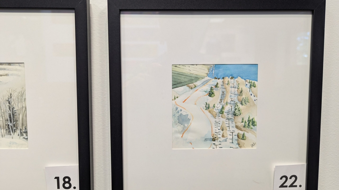
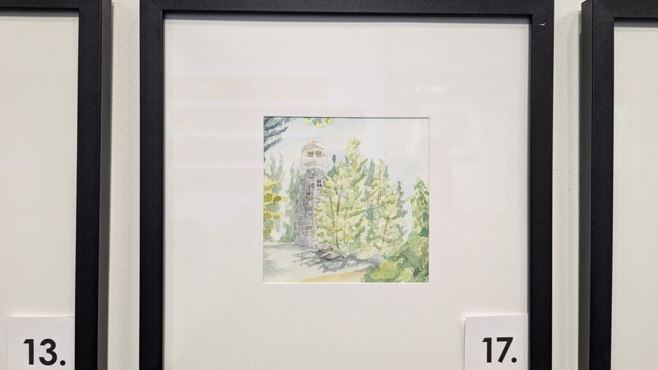
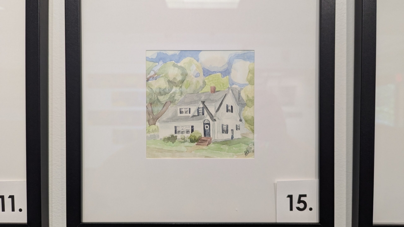
Elkhead Tower
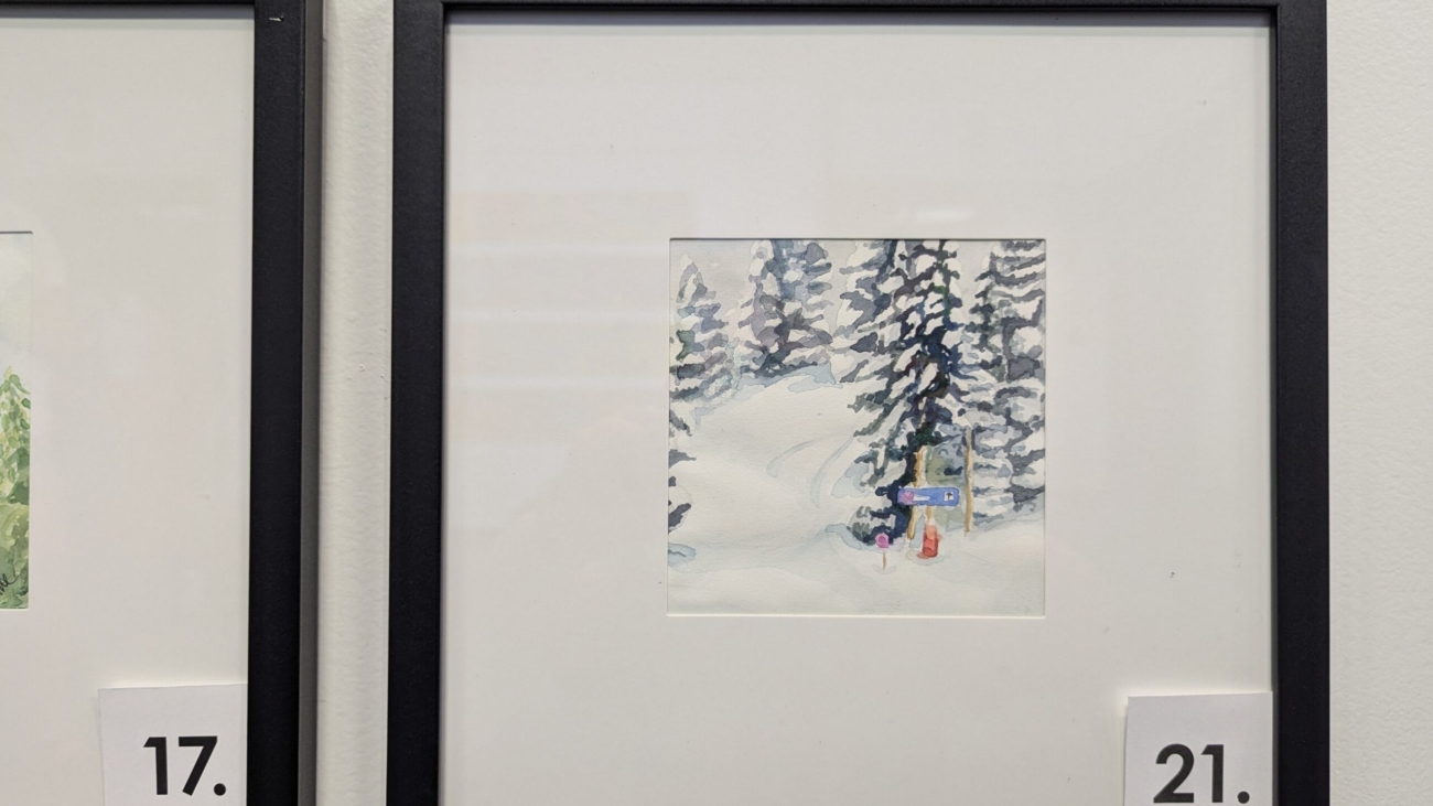
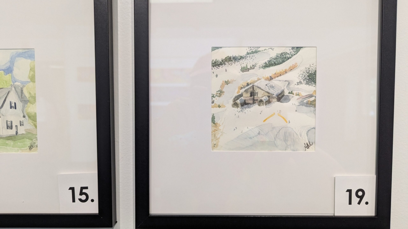
Cold Cold day. My hands hurt. Took a longer break with hot toddies and my similarly feeling friend.
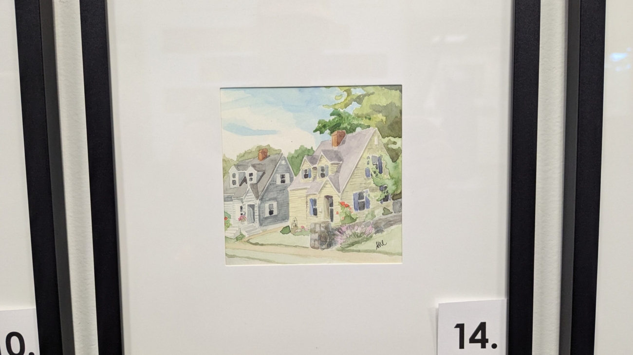
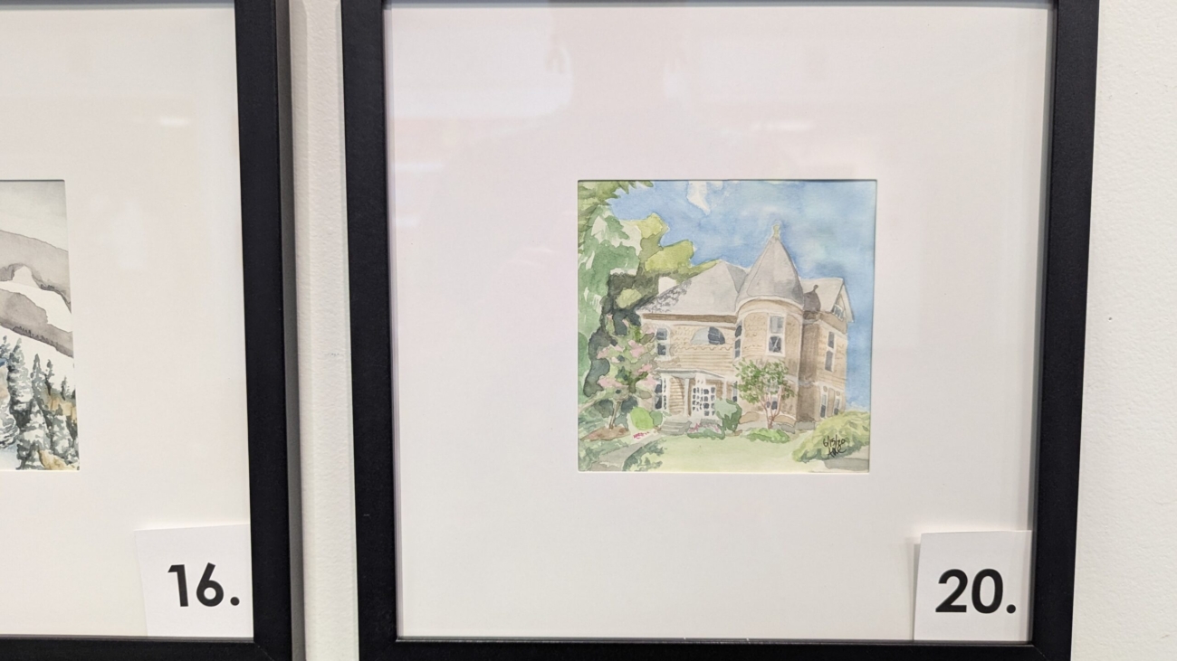
Twin Houses
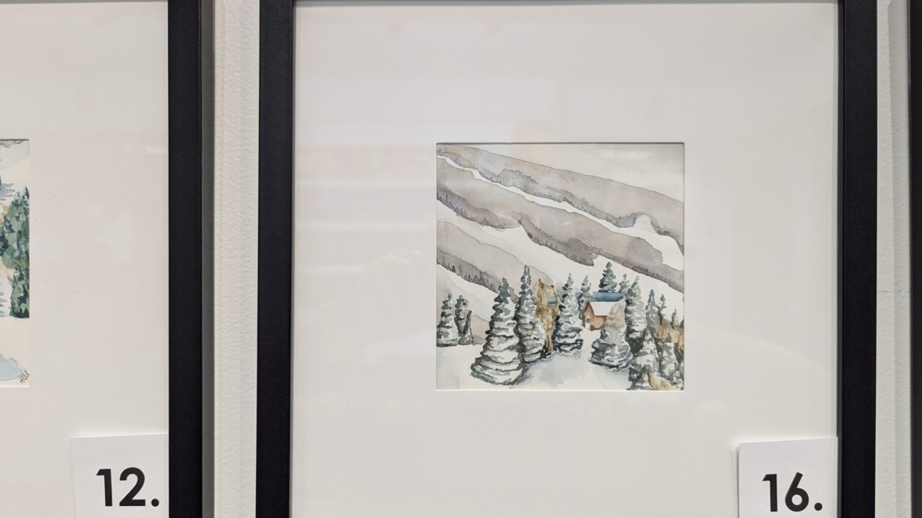
This was a longer rest for my foot. I’ve heard a creek runs in the basement of these twin floorplan houses.
Cold Cold day. My hands hurt. Took a longer break with hot toddies and my similarly feeling friend.
This was a longer rest for my foot. I’ve heard a creek runs in the basement of these twin floorplan houses.